
THE QUICK ANSWER
Rubik Variant Images & Swatch by Craftshift helps Shopify stores show the images that belong to a shopper's selected variant. It also provides visual swatches for choosing options. For products sold in several colours, patterns or finishes, that can make the product page easier to understand. Start with one product and test each option before expanding.
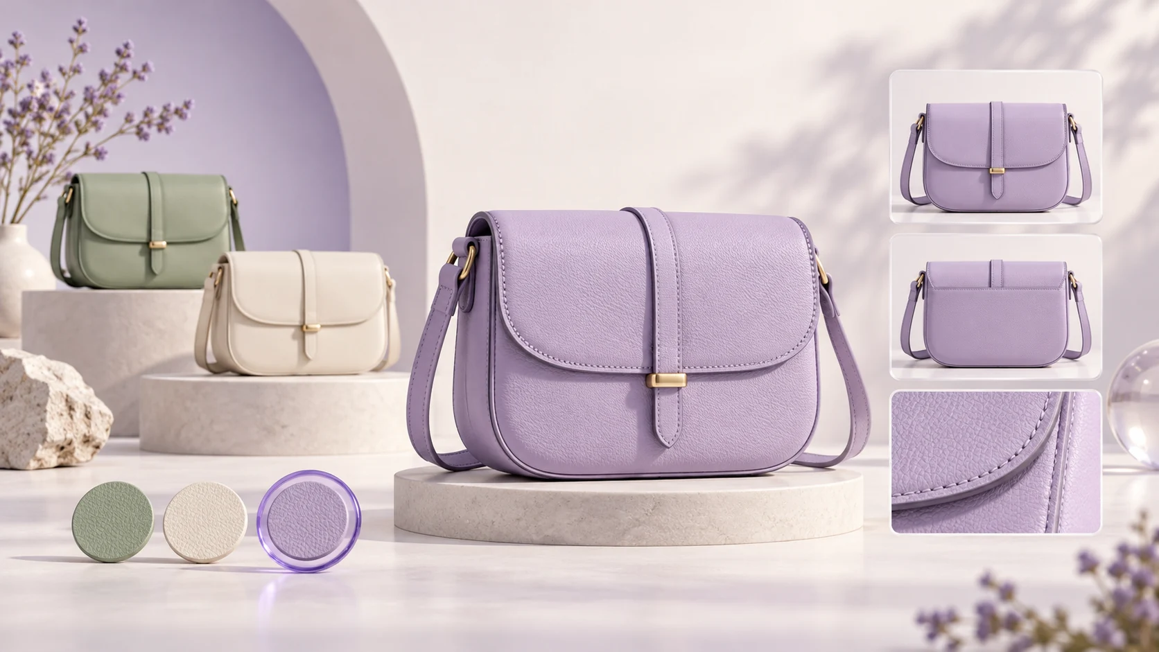
Someone sees a lavender bag, clicks through to your store and selects Lavender. The next photos show a sage bag, an ivory bag and a close-up with no obvious colour. The product might be right, but the shopper now has another question: which version am I actually buying?
Rubik Variant Images & Swatch tackles that presentation problem. This guide explains where it fits, how to plan a first setup and what to check before using it across your catalogue.
Craftshift recently featured RewardMe in its guide to setting up a Shopify affiliate programme. We are returning the introduction with this look at its Rubik app. The feature descriptions below come from Rubik's published materials, checked on 12 October 2026. The shopping examples and launch checklist are our own, not results from a store trial.
What does Rubik change on a product page?
Rubik groups product media around the option a shopper selects. A colour can have several matching photos rather than just a single main image. The app also supports video and 3D media, and lets merchants assign images manually or use automatic matching. These capabilities are described on its Shopify App Store listing.
Think of a fictional bag with three colours and four photos of each. When Lavender is selected, the useful sequence is the lavender front, the lavender back, the strap and the inside pocket. Switching to Sage should make that sequence about the sage bag.
The aim is a clearer choice. It does not replace accurate photography, product descriptions or stock information, and it is not a guarantee that more visitors will buy.
Swatches and image filtering solve different parts of the choice
A swatch helps someone choose an option. Filtering helps them inspect that option afterwards. You can have attractive colour buttons and still leave shoppers scrolling through photos of every colour.
Rubik's swatch guide describes colour circles, image thumbnails and text pills, with different presentations for different options. A thumbnail can help show a patterned fabric, while a size such as Large is usually clearer as text. The guide also covers enabling the app embed and adjusting the appearance.
For your first product, ask two separate questions: can a shopper find their preferred option, and can they then understand what that option looks like? Check both, especially on a phone where a long image gallery demands more swiping.
Start with a product where the difference is visible
Choose one product with meaningful visual differences and enough photographs to explain them. A bag sold in three colours is a better first test than a plain gift card. A shirt with different prints, a chair with different finishes or a bottle with different packaging could also work.
Before opening any settings, make a short image map. For each option, list the front view, back view, close-up and scale or lifestyle shot you want shoppers to see. Mark which images genuinely apply to every version, such as a care diagram.
Be careful with close-ups that look similar. A strap detail photographed on the ivory version might seem neutral in a thumbnail but look wrong in a lavender gallery. Review the full image rather than judging only its filename.
- Use consistent option names across your product data and your image map.
- Give every colour enough useful views to answer the same basic questions.
- Keep photographs truthful to the product, including texture and finish.
- Decide which information must remain visible for every choice.
A practical first setup for Rubik
Open the Rubik Variant Images & Swatch listing on the Shopify App Store using the link below. At the time of checking, its free plan covered one product, making a single-product evaluation possible. Check the current limits and billing terms before installing or choosing a paid plan.
Follow Rubik's current setup guide to enable its app embed on the theme you intend to test. Configure your chosen product and assign the relevant images to its visual options. If you use automatic matching, inspect the assignments before treating them as finished.
Rubik's website describes manual assignment, automatic matching and bulk grouping by gallery order. Pick the method that fits the condition of your catalogue. For a first evaluation, a small, carefully reviewed product is more useful than configuring hundreds of products before checking the result.
Preview the page with your own theme and product template. Custom selectors or page-builder layouts deserve a specific compatibility check with Rubik's support team. A general compatibility statement is not a substitute for seeing your actual page work.
Check the whole shopping journey
Run through the page as a customer would. Select every colour, move through its gallery, change the size and add the item to the cart. The pictures, selected option, price and cart line should all describe the same item.
Try the page on both desktop and mobile. Check that swatches are easy to tap, the selected state is obvious and option names remain understandable. If the product includes video, test playback as well as the still images.
Keep a small before-and-after record of the page and note any questions from customers about colour or appearance. If you later measure conversion, compare similar traffic and time periods. A promotion, stock change or new creator campaign can affect those numbers independently of the gallery.
- Switch between two colours repeatedly and check that unrelated photos do not linger.
- Change a non-visual option, such as size, and confirm the chosen colour stays consistent.
- Check unavailable combinations and the variant shown in the cart.
- Repeat the check after a theme or product-template change.
Where Rubik fits alongside RewardMe
RewardMe and Rubik work on different parts of a merchant's shopping experience. RewardMe lets creators join a store's affiliate programme, create Shoppable Reels featuring its products and share their affiliate link. Qualifying referred purchases earn the creator points they can redeem for the store's available rewards.
Imagine a creator demonstrating the lavender bag in a Reel. A viewer taps the shopping button and reaches the store's product page. On that page, Rubik can help organise the images shown as the viewer selects a product option. The recommendation brings the product to their attention; the gallery helps explain their choice.
This is a complementary use case, not an announcement of a native integration between the two apps. Do not assume a Reel automatically selects the colour featured in the video. Test the actual destination link and the product's initial selection, then make the intended colour clear in the content.
Our guide to Shoppable Reels, linked below, explains the affiliate journey in more detail.
Is it worth testing on your store?
Rubik is worth a closer look when customers must distinguish between versions of the same product and the current gallery makes that harder than it needs to be. Start with the product that attracts the most appearance-related questions, or one you plan to promote through creators.
If your current theme already presents every option clearly, first identify what you want to improve. The test should answer a specific question, such as whether shoppers can inspect all views of the selected finish without seeing unrelated versions.
Explore Rubik on the Shopify App Store and try a carefully chosen product. The useful result is simple: a shopper chooses a version, understands what it looks like and sees that same version in the cart.
Common questions
Can Rubik show more than one image for a Shopify variant?
Yes. Rubik's listing describes assigning multiple images to variants and filtering the gallery when the shopper changes the selection. Review the assignments for your own product and test all option combinations.
Does Rubik replace RewardMe's affiliate or loyalty features?
No. Rubik focuses on product media and option selection. RewardMe supports affiliates, Shoppable Reels and customer loyalty. They address different parts of a store's customer experience.
Is there a direct RewardMe and Rubik integration?
This guide describes using the apps for complementary purposes. It does not announce a native integration or automatic syncing between them. Check the complete journey on your own store.
Can I test Rubik before configuring the whole catalogue?
Its Shopify App Store listing showed a free plan for one product when checked on 12 October 2026. Confirm current plan details on the listing and begin with one product that has clear visual differences.
Explore the product
- Explore Rubik Variant Images & Swatch on the Shopify App Store
- Rubik: product media, image assignment and gallery features
- Rubik's guide to adding colour swatches and enabling the app
- Craftshift's guide to setting up an affiliate programme with RewardMe
- RewardMe: how Shoppable Reels work for Shopify affiliates